a new logo!
After more than a year since the last makeover, I thought it was time to refresh things over here.
The last couple of months I have been making up my mind where to take this. As you could read earlier on, that means no more ads and to make that decision even more pure, I also removed all the unnecessary logos and such. So, no more blogroll-buttons (which wasn’t a blogroll, but well…), no technorati-counter and feedburner-feed-counter anymore, I mean, I’m passed the 500 links in technorati (which makes this an A-list blog) and past the 1000 subscriptions in feedburner. That’s more than I ever expected, so those are no goals anymore, time to move on! ^_^
To add to all this, I asked a friend of mine, Iris to design a new logo for me, which is quite a daunting task I guess! Well, after I’ve seen her work and the way she works, I’m very glad I left that to her, I’m no logo-designer, that’s for sure! *^_^*
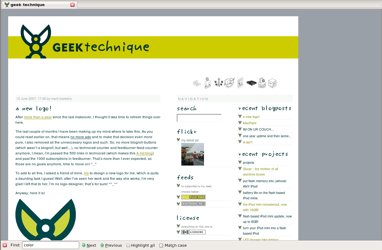
Anyway, here it is!

You could see it as a little man with wings. Then, when you try to look at it in three dimensions, it’s an open ball with balls rolling to your side. That stands for open source, my way of giving information and my belief all tech should be open. Then you could also look at the wings as eyes, which is a nice follow-up since the previous logo was a skull (and if you really want an explanation, then they’re Bates’ eyes (watching the premises) and not mine!) ^_~ As a coincedence (this was not meant by the designer) there’s the number eight which on it’s own means a whole lot of good things. And as a last one (also not meant), you could see it as a Pac Man, eating its way up… ^_^
...and if you’re not sure if you see this page how it should be, this is how it looks overhere. If you get things mixed up, hit reload (or shift-reload, ctrl-reload or such) to see if it changes. If somehow your favicon won’t change, click this, hit reload and go back. Same goes for all the bullets, if they’re still pink, click this, hit reload and go back.
We still have issues with the green… somehow it’s still not 100% right, but I’ll change that along the way… *sigh* designing, what a lovely job! ^_^
Please tell me what you think, any feedback is appreciated!
permalink -  add to del.icio.us


Hi Mark!
First, I really like your log! I’m a frequent visitor.
I like the logo, nice and stylish. Keep up the good work and cool mods!
greetsss
Mark! What have you done! I was so used to the stuffed header, I get to like it :-).
Anyway, cool and professional new design. I wish I could create logo’s like that, it rocks ;-), give my compliments to Iris.
Kind of used to the old banner, but aside from that the new logo looks not bad.
While your in a designing’ish mood, I have a few suggestions : – The little Home/About/Projects buttons take a lot of vertical space, and shove the “proper” content down quite a bit : Maybe they could be made a little more compact, or maybe moved into the same bar as the banner? (There’s a big gap, and since it’s a fixed width layout, there’s no danger of the buttons stretching the page out further than it already is)
Also having the buttons only occupy a small area on it’s own row means there’s a big blank gap – It almost looks like space for an advert… :P – This comment box is a little small, although that’s really dependent on what’s being written in it, and personal opinion I susppose – On the most recent blog-item, the “next: “ links has no title (Since it doesn’t exist.. yet). Maybe these could be made into a single line too? – Not 100% how hard it would be to do (It’s deffintly possible though), but after the “license” box ends, the content still remains squished and more white borders making the most important bit of the site [the content] smaller
Fairly random suggestions/opinions which your more than free to ignore, but they might make the site a little easier to read and that can’t be a bad thing
o/ – Ben
Great logo… but really, great site. :)
>but they might make the site a little easier to read and that can’t be a bad thing
no indeed! that’s the whole thing actually ;-)
I did make the comment-box bigger (never even thought of that…). About the navigation, well, I’m not sure at this point actually. In the previous lay-out I had the same problem and because of the new logo/banner I managed to move everything up by 200(!) pixels. For now that should be it. I’ll have to see if I can make it more efficient somehow although I don’t really mind people asking themselves “hey, that’s a lot of space” :D I mean, I want to make it a little more spacious and clean… but maybe I’m already overdoing it ;-)
>fixed width layout
well, yes, it is fixed, although it’s also scalable (that took me a lot of time once). If you change font-size (you could try ctrl+scrollwheel), the whole site scales up & down :-)
btw, I love suggestions like this, keep’em coming!
Looks great Mark! I’ve been reading this site for [insert obsessively long period of time] but doubt I’ve ever commented.
In either case, it’s one of my main “checks” each day, because you always have something fun to read, well, almost always, hehe.
A few things, since you’re asking for suggestions, the banner isn’t clickable as a “home” link, which most people (myself included) would be used to, from most any site. Also, the titles for the weblog entries aren’t clickable, unless it’s a design decision to only make the comment-link usable, I’d suggest changing it back (unless you weren’t already aware of it, but I’m sure you were).
Also, I (shudder) fired up IE quickly to check so this wasn’t some quirk I was only having in FF (the link issues that is) and the navigation at the top gets messed up with the transparent PNG. Since it’s on a solid background, just changing the backgrounds to white should fix it, or apply a PNG-IE-fix. Or just skip it and let those damn IE-ers suffer, that’s a good idea too. :P
That’s really the only things that popped into my head, I’ve never been bothered by a little bit of whitespace on websites, so the navigation area doesn’t concern me, even if I can see the points that’s been brought up about it.
Thanks for a great site as always Mark, now how about you finish this design thing up and get back to designing those freaks of technology I’ve come to love? :-) I want a Slurpr mostly because it looks like a fricken’ robot monster and I could scare little children with it.
/ Simon
oh wow! well, I fixed a couple of things:
the banner now is clickable (I tried that before but then IE would f*ck up, I now finally know how to make a clickable div…)
>Also, the titles for the weblog entries aren’t clickable
well, they never were, but I tried to fix that too. I tried to make the title clickable, but since that get’s replaced (with an image) I needed to do something else… I tried the same div-trick as on the banner, but then somehow my CMS doesn’t know which article it is… so… I now made the posted-date clickable (just above it…)... close enough? ;-)
The messed up top had to do with the fact that I made the images black&white… in GIMP I changed the mode to grayscale and saved them and then IE would f*ck up… so now I changed them back to RGB (they’re already B&W right?) and now it works (in the one IE I’ve got here…)
anything else? (here goes my weekend! ;-))
>>Also, the titles for the weblog entries aren’t clickable
>well, they never were
Hmm, I could’ve sworn they were, but I must’ve been wrong.
I skimmed through the source, and since your comment-system won’t let me post the html, all I can tell is that it appears to be nestled inside the h2-tag, correct? If so, you can apply the same trick straight to the h2-tag, no need for the div. Something like style=“pointer: cursor;” and then onClick=“location.href=‘url_of_post’;”
I really didn’t bother testing that too much, but it should, hopefully, work fairly decent, if you’re not interested (since you never had it and I just somehow imagined you did, possibly the RSS-addiction being responsible), just ignore this, haha.
Since I’m a code-junkie with a fetish for web development, I had to drop some tips for ya, hehe, and I know about the loss of weekends, I’ll tweak my projects over and over and over again, never able to reach perfection.
Anyway, I really like the changes, they scared me a little at first (I’m a man, by default we don’t care for change) but the greenish / brownish / yellowish elements add a nice touch.
Like the new logo, although the old one was amazing, this one is more elegant. And I dig the fact the homepage is no longer machine-gunned with logos.
logo: a little man with big ears ;)
>Something like style=“pointer: cursor;” and then onClick=“location.href=‘url_of_post’;”
yes indeed, that’s what I tried, but somehow the txp-xhtml-tags won’t render on the place of url_of_post… but, in the end it worked out to have a permalink-tag above the h2-tag en the /permalink under it…
I changed the comments a little bit too, now those permalinks make sense, before they would show the comment after the one you would link (because ‘a name’ would be posted under the comment, not above it…)...
Anyway, a friend of mine now told be my mail that maybe the bullets are a little bit too much, is that true? (I guess so, now I think of it, ah well, that’s easily changed)
I like the new look, but I did really like the old skulls and iBook keys theme.
Great, looks a lot cleaner now which I like a lot.
It’s just the color of the banner.. it’s kindo f ugly I think (the color).
Wasn’t sure which green you meant but I hope it was the one I mean ^^
The logo makes me think about your cat…