alpha-testing the new site from now on...
Right, after quite some days up in css-trickery and such I totally had it!
Noooooo, that’s not entirely true, but I’m gonna loose a little of my professionalism here and start plugging the new site over the old one… this process will probably take tonight and the bigger part of this sunday. In the mean time chances are, this site looks… euhm… not like it should :-)

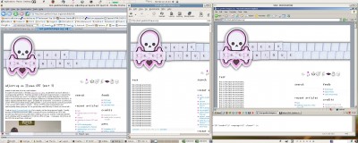
3 browsers (including IE! through VNC…)
click to enlarge (2560×1024!)
with textpattern wrting everything inside a MySQL-database, I don’t see any other way than to manually transfer all the settings/templates and such. When I would dump the test-database (including the new design) into the live site… I would lose some posts and such…
Oh… and start complaining you like the old site better not any sooner than this monday, okay? *^_^*
Oh(2)... Geez, it’s incredible how many hours one can spend on something like this… my pride & joy, the navigation, which became something like a fake dock with minimalistic vector graphics has taken more than a day (close to two days I guess…) and in some settings it isn’t always behaving like it should. The whole design should be scalable with font-size. In firefox it behaves quite well, but on some other browsers only from default view to bigger font-sizes, not smaller… (don’t try that! ;-)).... pfffff… well, one day left to get it all right…
Message from Mark's family this site has been made static. This means that it will be no longer possible to comment on his ideas and projects, but that we all can continue to cherish his creativity.previous: MacPlus video-game that never was...
 add to


Sweet New Design!
Nice work mark! is based on serenity template for textpattern?
wow, thanks :-) I’m going to spend a great deal of my sunday to get all things straight…
I indeed took serene as a base(I guess you mean that one?), will get the credits straight. I changed a whole lot to it and I need to credit the IRIX-icons I used in my navigation as well and such… but that’s sunday… beta-test-sunday! ;-)
Damn sexy!
Good job Mark!
New design looks promising,...but! Right column is IMHO a bit messy and navigation icons (which are cool) don’t look like they are for navigating. I hope you know what I mean. Maybe put them a bit higher and maybe in the right-center.
alright! thanks for the comments so far, I’m gonna be tweaking and tuning this thing a little further today. I just dumped the database of the live site back into my test-environment (and then all of a sudden, it’s a feature textpattern’s got everything written into one database, it only takes two commands to get them alike). Anyways, I can beautifully test out some browserspecific issues which have led to some strange choices in that environment. I’m on it! ;-)